Brand Refresh

Established in 2007, Element Electronics set out to be the most inclusive technology company in the market. For years we've been producing TVs with the latest technology at accessible prices – but now it's time we do more. As we looked at our business's changing landscape and added additional products, we felt it was the perfect time to reestablish our brand voice and energize our visual identity.
Team Effort
Our internal creative and marketing team began the process by conducting internal brand advocate interviews with team members throughout the organization and held one-on-one interviews with key brand stakeholders. Our team believed this to be an essential part of understanding our employees' perception of the brand, its higher purpose, and Element's long-term vision.
"Building our brand from within allowed us to understand the perceptions, experiences, and beliefs of the people that know our brand best," said Danny Kusz, Element's Creative Director. "From there, we were able to extract common themes and create a genuine brand based on integrity. We knew that to transform our team members into brand ambassadors, we needed internal validation, and in turn, show up for our customers with a clear and unified brand."
Through this research, our team was able to create a new brand platform. We workshopped three concepts and combined parts from each idea. We didn't have a mission or vision statement, and our team felt this was a crucial step in building internal brand advocacy, communicating consistent goals, and aligning our team's vision.
"Our team has worked hard to launch this new branding as part of an ongoing evolution of Element," said Vlad Kazhdan, Element President. "As our team and product line continue to grow and evolve, this is the perfect time to refresh our brand identity to match our values and mission."
Brand Tagline Update
We also took the time to update our tagline. Our team landed on "Bring it home." This tagline is an amalgamation of our brand personality and mission, the industry we serve, and our core values; it is also a motivational statement that encourages our employees always to do their best. It's a friendly and actionable sentiment that invites consumers to become part of the Element community. It speaks to our business's inclusivity – everyone can easily afford to bring an Element product into their home. The word home not only speaks to consumer electronics and appliances but also represents our American roots.

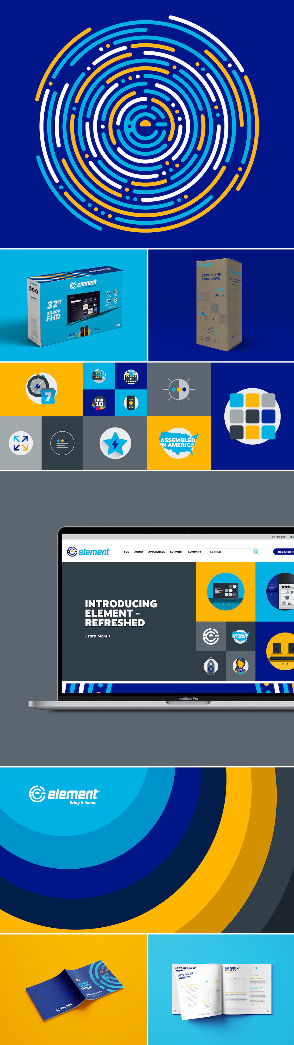
Logo and Wordmark Evolution
Our logo looks a bit different these days too, but it's not a complete overhaul. We believed keeping our old logo's integrity was essential to remind us of where we came from. The new logo graphic, which was made solely from circles, combines four key elements: our name, our industry, our dedication to service, and our rich community of team members, consumers, and customers.
![]()
The new wordmark is also an evolution from our current mark. The goal was to keep the mark's futuristic and modern integrity while still infusing our new brand's softer design language. The italicized font gives a sense of forward motion making our logo feel actionable, which pairs well with our tagline.
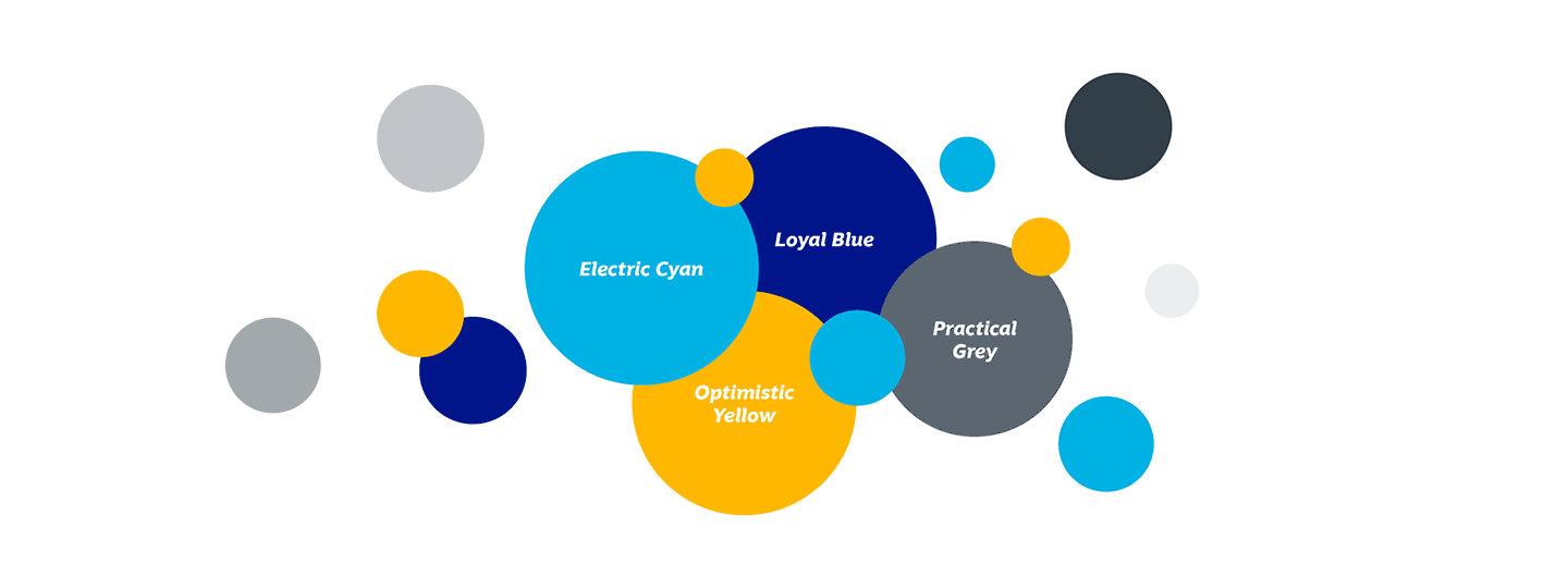
Brand Colors
When it came to brand colors, we decided to brighten it up a bit! We know that color is one of the most important assets of a visual identity and is one of the first things people remember and associate with brands. Research shows that 60% of purchase decisions are made on color alone, so we selected colors to match our brand's psychological profile.
Electric Cyan is an evolution of the old Element blue but with added saturation and vibrancy. This attention-grabbing color instills confidence and inspires feelings of joy and self-expression. Our Optimistic Yellow energizes our brand as it's the color the eye sees first. We use it to bring out feelings of positivity, happiness, and optimism. Loyal Blue grounds our brand due to its calming nature. It's often used as a color to reduce stress and conveys trust, loyalty, and security. Practical Grey is a neutral color used to stabilize and ground our color palette. It gives feelings of reliability and practicality.
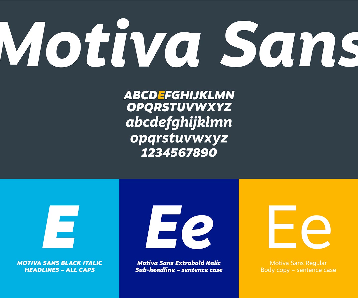
Brand Typography
We've refreshed our typography to Motiva Sans. This typeface has just the right amount of personality yet is timeless – just like Element. It is very expressive with unique letterforms but doesn't scream for attention. It is a great, everyday typeface and is often associated with the Everyman archetype.
Brand Archetype
We have also adopted the Everyman archetype to explore our brand more creatively and intuitively. Using this archetype establishes a richer personality and voice for our brand and creates a stronger connection with our audiences. We strive to make a complicated industry easy to navigate for our customers. We are a neighbor that always seeks to do the right thing for our community of employees, customers, and consumers. We radiate a sense of positivity, approachability, and reliability. We are motivated by a sense of belonging, the enjoyment of life, and the need to forge meaningful connections with people.
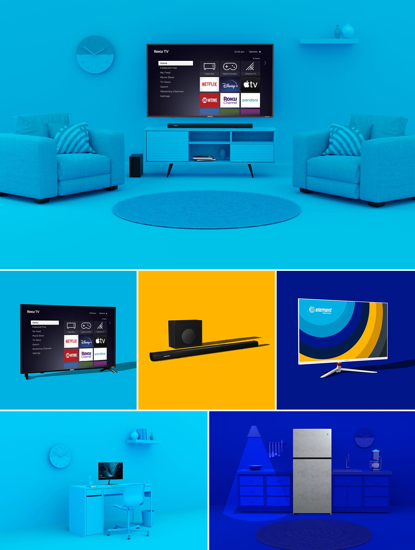
Brand Photography Makeover
Our photography has undergone a total makeover. We know that our photography is an essential extension of our brand. We've minimized the surrounding environments and are taking a monochromatic color approach to make our products become the hero. When looking at other photography in the electronics market, we noticed a similar visual tone that is almost hard to distinguish one brand from another. We felt there was an opportunity for Element to disrupt the market and stand out with photography that feels practical, friendly, and inclusive.
Our New Look!
Our team has worked tirelessly for months to pull off this brand refresh, and we hope you love our new look and feel as we do!
Bring it home.